- Scarlet's clothes are based off the Nintendo character Mario, as they share a similar colour scheme and outfit.
- Mario wears a red hat, long blue overalls with yellow buttons, red long sleeved shirt, gloves and brown shoes. Scarlet wears a short red shirt (with an 'S' design on it), blue overalls (with a big pocket at the front), white knee high socks with a red trim, and black shoes.
- These two characters are very similar in terms of design, but the shapes and expressions of each character keep them both unique and distinct. The designer did a very good job on taking elements of an existing character and create an entirely new one without making a carbon copy.
After Transformation Clothing:
- The clothing design for after the transformation allows for the front design of Scarlet's shirt to show the design "S" on it. The character pack explains that the "S" stands for "Superman" and also "Scarlet" which could emphasis her newly found confidence.
- I feel like it also has a double meaning which shows her new friendship with the snake.
- The designer also played around with different types of transformations with her overalls, at one point only one strap was shown to be pulled down. In the end I think that she stuck with both straps being put down as that is a good indicator to show how her personality has fully improved and shows a lot more confidence.
Shape:
- Scarlet's face is shaped like a square, but still retains the circle form, making it seem round in some angles looking up, and sort of squarish when looked at straight on.
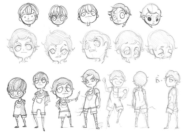
- The facial expressions of the past Scarlet designs are all very nice but the final design with the droopy eyes is the best one - the personality of Scarlet is very much defined by her expressions and I think that the way that the designer created her eyes adds a lot of distinctness to the character that differentiates her from other existing characters.
- Looking at the development sheet the designer kept the shape of her head fairly consistent and mostly played around with the height of her body.
- The designer wanted Scarlet's body shape to be long to contrast with the antagonist who has a squashed box shape.
- Some body shapes in Scarlet's development look either too long or too short in comparison to the head size, but the middle ground that the designer found allows the character to look very visually pleasing.
Character:
- Her pose before the transformation is quite reserved and shy, whereas afterwards her hands are placed on her hips and the expression on her face is much more confident.
Transformation:
- Some parts of character development are shown through her smile, for example she used to have two rows of fully sharp teeth, but this idea was not used due to it being too similar to Riverford. Instead only one tooth is shown when her mouth is open.


No comments:
Post a Comment