Sunday 26 June 2016

Final Blog Entry


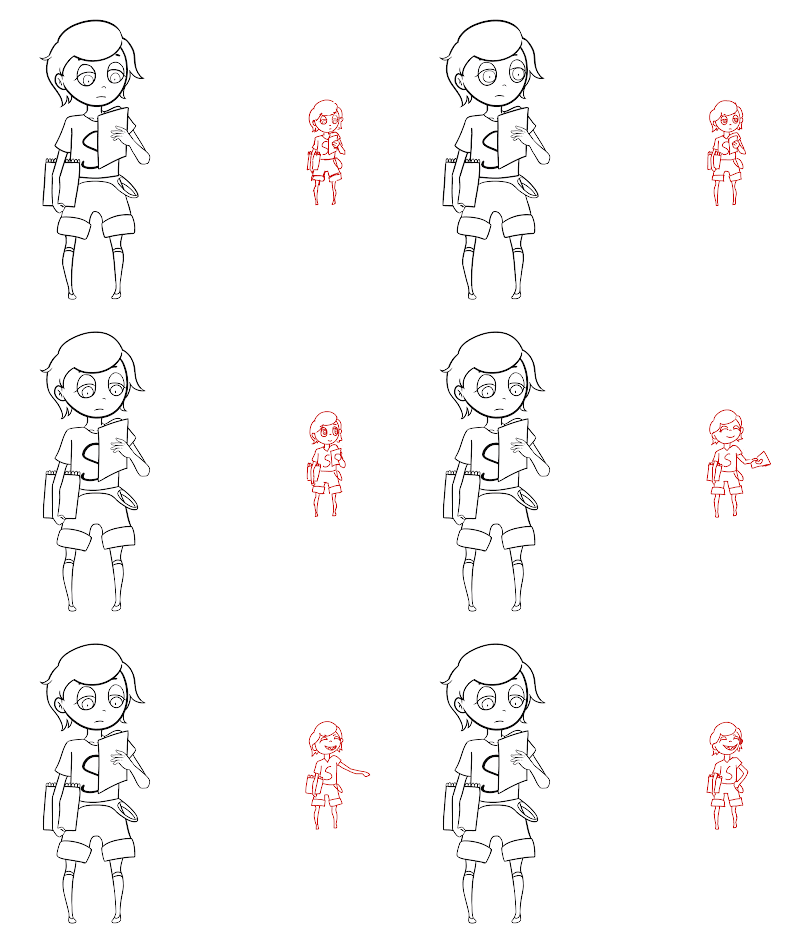
After weeks of work I've finally reached the end of the road for this animation. I am satisfied with what I ended up with, but due to some last minute problems and time restraints I couldn't complete the flying part. I find it a little sad that I put so much work into the sky and the colours but couldn't execute it at all. That said everything leading up to that point - I have stayed true to the original idea and sketch, honestly the flying part was something extra that I wanted to do but even without it my animation is still a very smooth transformation which I am very happy about. Now that the main things are out of the way I will start with the small details.

At the start of the animation the I was a little confused about the character that I was given - it seemed to me, a little hard to animate a character who didn’t have much of a transformation other than expression and a small clothing change. However after asking the around the group I was assigned and talking to the teacher I decided to make the main character Riverford, the snake who transforms into a dragon from eating the drawings of Scarlet instead of destroying the forest and town by eating them. I got this idea a few days after we received the character packs and before then I analyzed the character package like crazy but I realise now that everything I researched was about Scarlet and nothing about Riverford because there was basically not information about him at all in the character pack. Because I didn’t do the research before hand I did it during cleanup - googling snake heads in varying directions such as front, side and open mouthed. I also had to research the movement of snakes and how their scales would behave while moving as my attempts of this without the study proved to look stiff and unnatural. During the sketch I drew out beforehand where I wanted the snake to be and its position.


From the first moment I started thinking of all the animations I could do with a colour eating snake and an artist girl - the idea of Scarlet throwing a paper into the air while Riverford snaps it up was something that just… stuck with me. I considered other ideas of course but I really did like my original idea so that is what I started to do. Some other ideas that came to my head are this:

- Scarlet drawing on her notepad, the camera is in a bird eye view and zooms into the drawing. As it zooms out again Scarlet’s straps around down and she is looking more confident.
- Scarlet would throw paper in the air while the ‘buttons’ of the overall will pop off and will stand there beaming.
- Riverford and Scarlet sitting underneath a tree, he goes and eats her notebook while transforming. They look happy at the end.

When I first started designing the snake, the first thing that came to mind was paint-like wings created from the colour that he will eat from Scarlet to transform. The main feature that I was inspired by was Lapis Lazuli's wings, a character from the popular TV show Steven Universe. I watched many videos on the physics of those wings, how they moved - and even she had a transformation scene where they spread from her back. Unfortunately I discovered around the same time that the original creator had also designed a dragon transformation for Riverford, not included in her character pack but on her blog instead. I went up to ask her if I could use my design instead and she agreed that it was fine so I went ahead and did that.


The colour scheme was the fun part. Because of the colour eating theme, it gave me complete freedom for what I could use and I took full advantage of it. To be honest I didn’t consider many other colours I just gravitated towards purple and yellow. This may seem odd but looking back on it now I can see it is because I have a character of my own I created that has a very similar feeling towards it and I wanted to pay homage to that character, he also happens to be my blog icon! During the colouring phase I had a lot of trouble getting the colours right for the pre-transformation Riverford. Firstly line colour and secondly the transparent colour itself. I asked some of my friends what they thought of what I came up with but they had comments such as:


This really helped me out and I settled with a kind of matte colour that had a purple/orange overlay but it wasn’t extremely damaging to the eyes. Also while in after effects I did the colour differently because I had to work with transparency. First I had a PNG sequence of the snake moving, but set the layer type to Hard Light. Then underneath I had a second PNG sequence that was exactly the same but this one I set to multiply. This gave the effect of the hard light that I loved but it wasn’t too bright or transparent for the eyes. I also played around with the outer glow and opacity of the snake.


Some colour variations, I decided to go with the pink colour.

During cleanup I realised that the snake I originally sketched up was a little, different, to what an actual snake and the reference looked like so some major surgery had to happen there - this made time management a little more difficult than planned but it didn’t stop there everything after the turn was also very different. The head size was too large and face was not in proportion I believe that I could have managed my time a lot better - I really ran out of time and couldn’t finish the assignment completely. Some other problems that I faced while cleaning up was getting the head shape right - the original sketch was just a circle with a snout attached to it but after studying snake anatomy closer I realised that it is much more complicated. There was supposed to be bumps where the eyes were, a sharper more square snout and because I had to clean up the horns I had to change the head shape to show that they were growing there.

My background was no trouble at all - after looking at a lot of forest inspirations I started to sketch out layouts that I would be happy with. The first one I came out with was not good to say the least so I was much happier with the second one that turned out to eventually become my final. For a style I wanted to do a sort of 2D storybook feeling and after my classmate allowed me to use one of her background from a game she was making everything came together very easily.

I’m pretty happy about my blog posts, I wrote a pretty standard entry every time I blogged explaining exactly what I did that day and the research I did. I found out that I find it kind of relaxing to just talk about what I did and explaining stuff - I believe this is an improvement to the start of the year where I barely posted anything at all, and when I did it wasn’t very descriptive and just gif updates with no context. As an animator I feel like I’ve learned a lot and definitely am proud of myself for what I achieved. Again I still regret not being able to finish the flying arc in the animation - I definitely bit off much more than I could chew where I spent too much time focusing on correcting the smaller details such as the linework and colours where I could have put that time into completing the flying. I feel like I appreciate animation a lot more now, when I’m watching shows and complicated animation happens in 6 or more seconds I always think, “Damn. That would have taken me more than a month to do.”

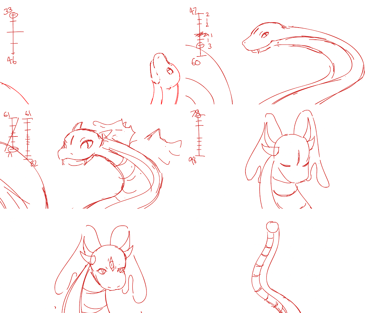
I would also like that thank the teacher that made all this possible, Dane Jacobs, for being super helpful and just giving me all sorts of advice and tips that I couldn’t have learned from home - some days when I was struggling with certain parts of the animation this teacher solved problems for me in a flash - this is regarding things such as timing charts of the snake movements and the eye opening sequence. On my own they looked ok, but with the advice taken from the teacher I made them a lot better.

Overall I think that I am pretty satisfied with how this turned out. Yes I could have done a lot better but this being my second time animating something so complicated in my life I think I have done well. I realised that I waste too much time on smaller details when there are much bigger things I should be doing and I think in the future I will try to focus on this to really create a better animation.

Thursday 23 June 2016

Coloured Scarlet and After Effects


When i first started colouring in Scarlet, I just colour picked from the official character pack. I realize that when I actually insert it into the animation and background it will look completely would of place however I worked around this by adding lots of overlay and multiply layers to give the illusion that Scarlet was part of the background and not just sloppily pasted onto it.


Here is what the final result looked like, I used colours such as red, yellow and orange as those are the colours I used for my background as well. Thus she blends in well and looks like she was there the whole time. I also added shading via multiply layer over all her frames, because she does not move much so it was very easy for me to do. Another thing I tried doing was a light yellow outline around her so she matches the style of the animation as well. I realized after doing one frame that I could just do an outer glow on After Effects so I stopped and figured out how to do that on there. That said I have started compiling everything onto After Effects and did the 3D layers on the background, did the camera movements and put in Scarlet.

I still need to colour Riverford, draw his wings and flying animation. I believe that in the next few days I can achieve this. Because the files are not able to become GIFS I just screenshotted one frame on my After Effects file.


I honestly had so much trouble with the camera movement, it just was not moving where I wanted it to. After watching many tutorials I ended up deleting the Null Object and starting over - to my surprise it worked and after many hours I finally ended up with a slow pan as Scarlet is throwing the paper into a faster zoom out as Riverford jumps up to eat it (shown above).

Tuesday 21 June 2016

Riverford 26 Frames


[Edit - Cleaned up Version]

Kinda had a lot of trouble getting the head movement right from frames 20-26, actually had do add in a extra frame because the body movement was a little jumpy. I think at the moment the ending looks a little choppy but only because I roughed out the scales - when I fix it I think it will look a lot smoother.

Monday 20 June 2016

Riverford Update


So far I've drawn out 20 frames. The last few are just sketched out because the sketch that I had previously done was so out of proportion and basically unusable.

Sunday 19 June 2016

Inbetweening Riverford


I decided to upload how I inbetween Riverford and how I keep the proportions consistent throughout the animation. I actually do all the very rough sketches on flash with very inaccurate proportions so when I start cleaning up I actually have to ignore them and draw a new picture from scratch. However I use the general position of what I did in flash including the amount of frames that I need so I don't draw too many or too little. Would like to think of what other people think of this method and if it is efficient or not!

First Phase Complete

[FIXED - SEE BELOW]

I have split the animation of Riverford into four sections, the bite, turn, tilt/eye open and jump. I have finished the first part and now I'm going to start on the second which is when Riverford turns around to face the camera.

This is the position of Riverford off camera, not to scale. I might seperate this part from the main snake and blur it out to make it seem closer to the camera in after effects. I'm not sure if that will be too distracting so I will ask the teacher at some point.

 
This is the old animation. Just by looking at it the ending part, and even the parts leading up to it seem very off. The movement of the bottom of Riverford is very jerky and moves very far, also the scales do not match the movement of the head. Thankfully after looking at this for a while I determined the issues and have fixed them (shown above). I looked at the snake from the Jungle Book as a reference for the movement.

Saturday 18 June 2016

Riverford Cleanup Progress


I've begun cleaning up Riverford, and honestly it is a little harder than I expected. Due to me not having much experience drawing reptilian faces it is a bit challenging to get the head shape just right so that it looks good and not goofy (like some of my previous attempts lol). In any case compared to cleaning up Scarlet this is much easier - I've already done around 4 frames so far out of 36 so I think I'm making good time.

The one thing I'm worried about is the colouring and how I am going to achieve a water colour effect - although I suspect I'll just have to do it manually.

 
(A failed attempt at drawing Riverford)

Scarlet Cleanup Finished


17 Frames in total, and the animation for Scarlet is complete (minus colour). It still looks a little choppy near the end for my tastes however I still need to start cleaning up Riverford and that is my top priority.

If I do end up with extra time I think I might add some extra frames to smooth it out otherwise I will leave it as it is because it looks fine like this, it's just my personal preference to add more frames.

[Edit]

Fixed the frames leading to the eye closing with the advice of some friends. I added a quick fix by drawing in the bottom of the eye for a smoother transition.


Friday 17 June 2016

Scarlet Cleanup


Since my sketches are usually very clean - It's very simple to lineart it. I've already done 2, so 15 more drawings to go - then I will start the cleanup for Riverford.

I have a week left to finish and put everything together in after effects but I think I can finish in time. Wish me luck!

[Edit 1] 5/17 Frames

[Edit 2] 10/17 Frames

[Edit 3] 13/17 Frames

I noticed it was still a little fast, so I spaced out some of the frames at the start of the animation.


Thursday 16 June 2016

Scarlet - Draft Composition


Trying tot decide on a colouring style, since the background has bright think outlines I thought I would also coat Scarlet, the paper and Riverford in one also.

The animation is also looking a bit fast, so I think I'll try to slow it down a little and add more frames if that will help.


[Edit]


Tuesday 7 June 2016

Eye Openingly Amazing!

With the teachers help I fixed up the eyes opening. Using the squash method it is looking much better than before.


[Pictures from my teacher Dane]


White Outlines?

Finally getting around to cleaning up my background, and thinking of adding white outlines to my trees and other things. I am really in love with this style and I think that it will add some kind of whimsical look towards my animation - due to the concept itself and even the original story looking very fantasy based.

Adding white/yellow outlines to the trees will help give my animation an asian look, which is something the original story is based on (french/korean setting).


[Artwork done by my classmate, Hyemi Park]


If I do end up going for this look, I will probably make it a lot more intense as this is just a test picture that I will show to teachers and classmates for feedback.

Fly High Riverford!!

This is something that I decided to do with some of the teachers help. I am going to do a camera pan upwards to allow for the wing stretch look much more dramatic and give a lot more impact to the viewers.

This means I will have to play around with some more sky views and study what clouds look like from underneath, because even though I am panning upwards, it will be an under angle shot.

I think that this is a lot more impactful than the slight camera zoom out I was planning on doing originally.

Sunday 5 June 2016

Roar!

I've added a rough draft of what I want to happen. I'm trying to figure out a good way to make Riverford pause or have a resting period during the eye close scene, then that way when he finally comes up to roar and have the proper wings sprout it is more dramatic.

I need to add more frames and clean up etc. but I think I am happy with the direction that I'm going in at the moment. The timing chart is not filled yet because I am still adding in frames till I'm happy enough to play around with the timing of the frames.

Wednesday 1 June 2016

Wing Research

So now that I'm reaching the stage where I have to flesh out what I want the wings to do and where to go. I'm actually thinking that I don't need to animate the third eye? Because I want the head to tilt up as if the snake/dragon is roaring, or if I dont do that maybe just a small head tilt upwards to show that Riverford is looking at the audience very elegantly. I think that because the starting of the animation is quite rough and snappy, it would be a good contrast to end the animation smoothly, but I'll see how it goes.


[Dragonair from "Pokemon" is a good reference to use due to it's shape language being very similar to riverford]

I researched some animations of wings, mostly feather wings although they should follow the same physics as dragon wings:

[Anime Refrences]


[Movie Refrences: Maleficent, Black Swan]


Although I did find a few dragons, I was thinking of maybe changing it so the wings go in front of Riverford, then expand outwards from there? It's worth a try I think.